Streamlining house appraisals by addressing pain points and optimising data gathering. Valuators assess land factors, creating a need for an efficient process.
Objective
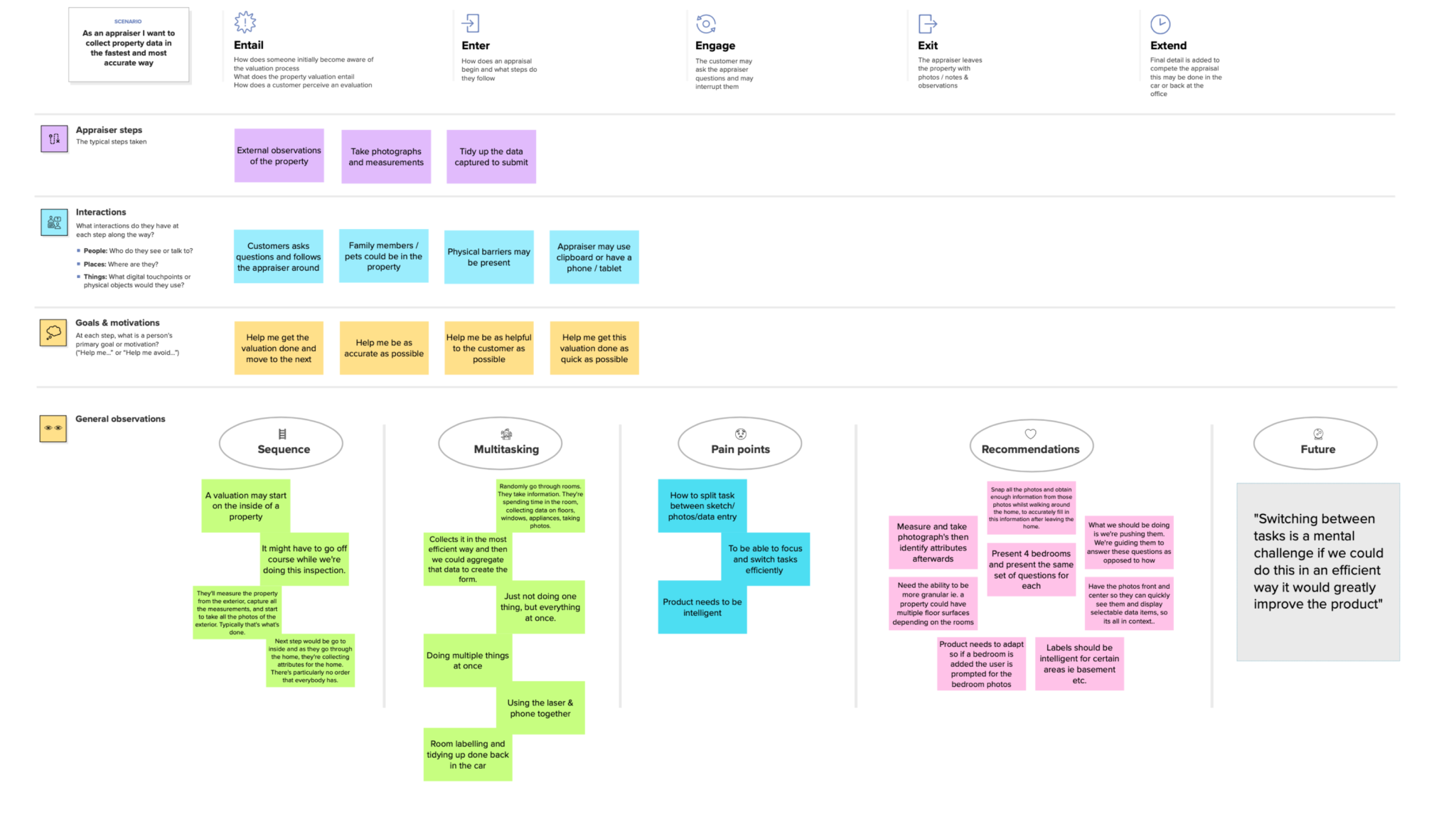
To streamline the house appraisal process and address pain points experienced during property valuations, it’s essential to understand the valuator’s perspective. For instance, during an assessment, the valuator behaves similarly to a prospective buyer, carefully evaluating the property’s land based on factors such as topography.
Goal
Facilitating appraisals that are both quick and accurate, reducing time or improving precision, and presenting these within a clean, intuitive interface..
Process
Users provided weekly feedback, ensuring a consistent flow of insights. This feedback was gathered primarily through working prototypes, workshops, and workflow mock-ups.
Artefacts:
Analysis of app structure
Pain points and frustration
Early flow plan
Output from user workshops
Wireframes
Redesigned screens
73%
Of appraisers provided
feedback during the initial testing phase
32
Feedback sessions conducted with appraisers in the field.
App structure analysis
A review of the app structure created a clear, logical navigation system, showing relationships between screens to ensure users could easily find what they need. The audit helped the team organize content in an intuitive, user-friendly way.
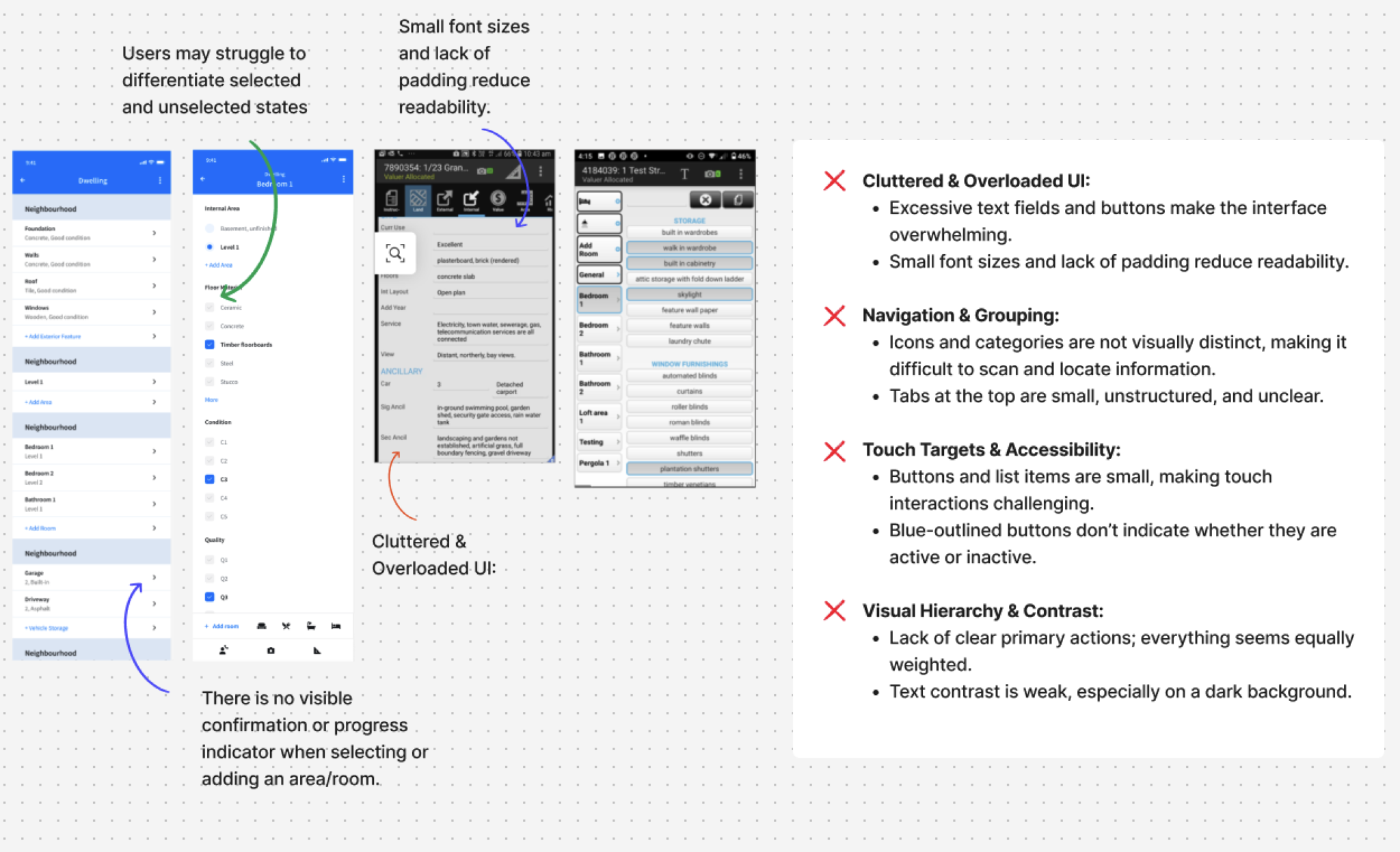
Old app UI issues
Challenges and obstacles
Business challenges
Excessive sub-levels and unclear workflow length
Long scrolling screens, Users feeling disorientated
Confusing workflows
Streamline data collection for faster, accurate field appraisals
Enable smooth context switching without workflow disruption
Present data intuitively for improved user productivity
"Appraisal times need to be reduced, 1hr 30 mins is the current time taken"
Output from user workshops
The aim of the workshop was to improve the user experience by identifying user needs, pain points, and opportunities, and to better align with the group. The main findings of the workshop were:
Appraisers faced frequent interruptions while capturing large amounts of data in the field
Frequent context switching required an interface designed for seamless transitions
The appraisal process had varying steps, requiring a flexible and adaptable workflow
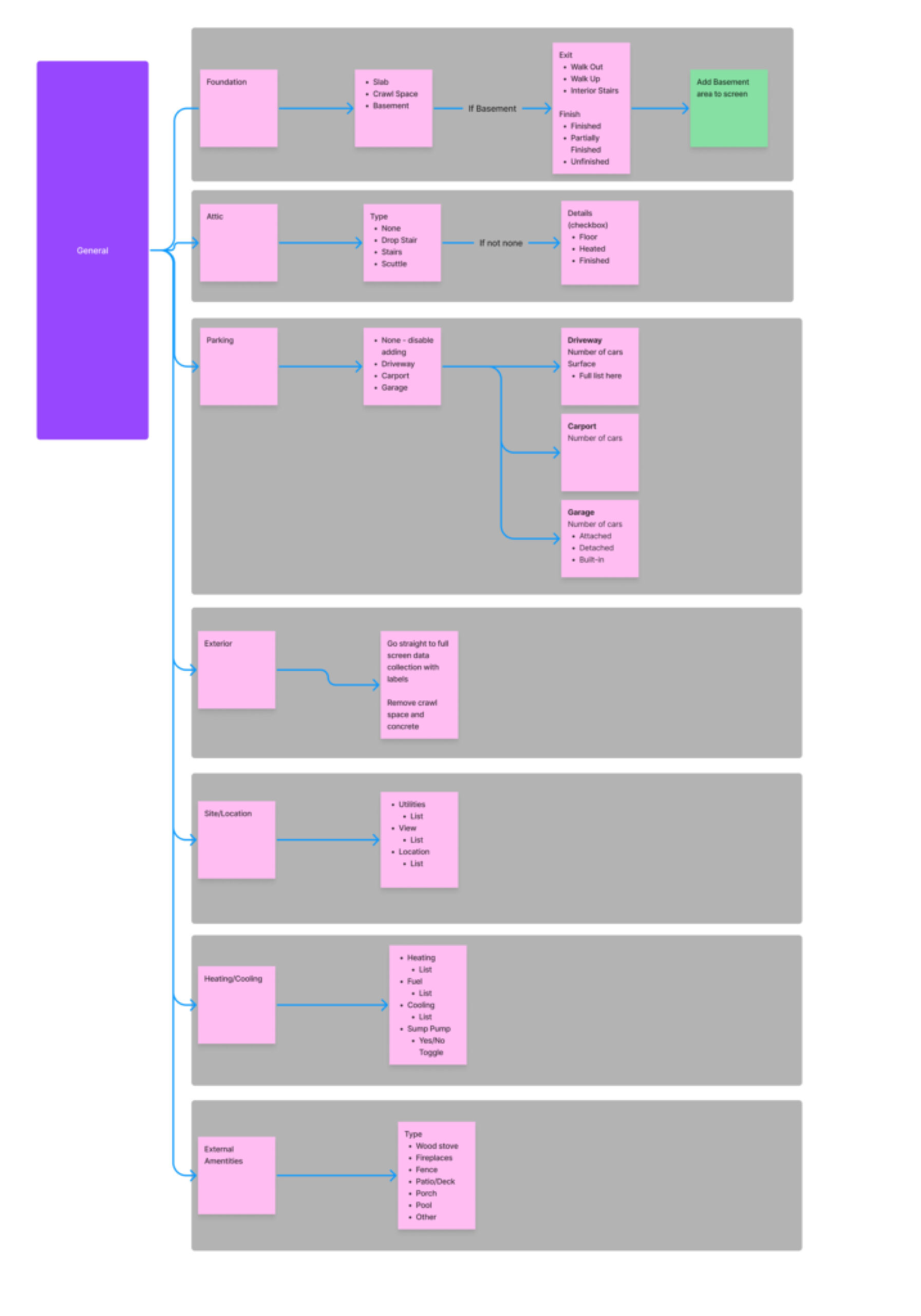
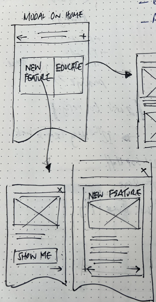
Validating ideas
Flow diagrams and prototypes were used to test scenarios and validate design decisions, ensuring stakeholder and wider group buy-in. This included every interaction users had with the product, from a modal and date picker to a bottom sheet.
Wireframe design concepts
Appraisers faced frequent interruptions while capturing large amounts of data in the field
Frequent context switching required an interface designed for seamless transitions
The appraisal process had varying steps, requiring a flexible and adaptable workflow
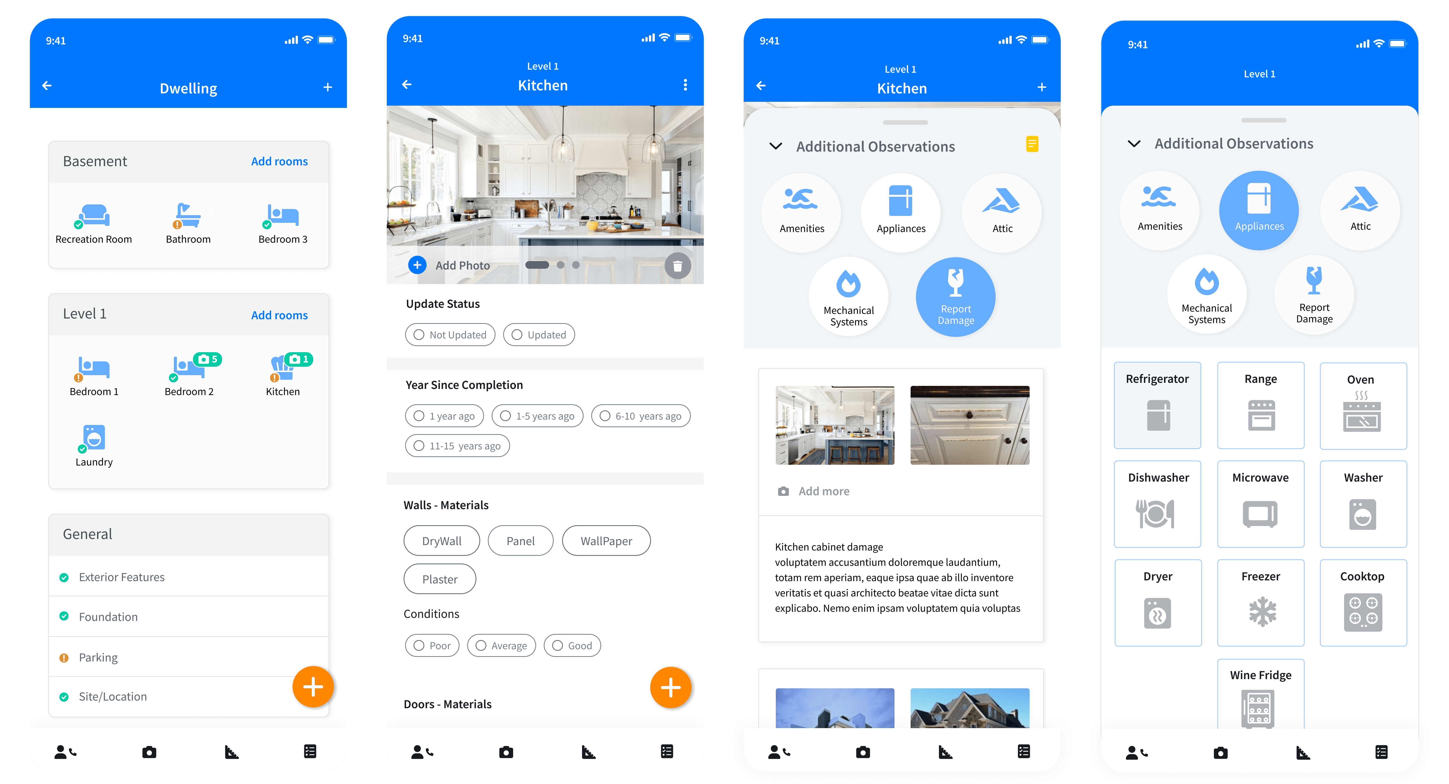
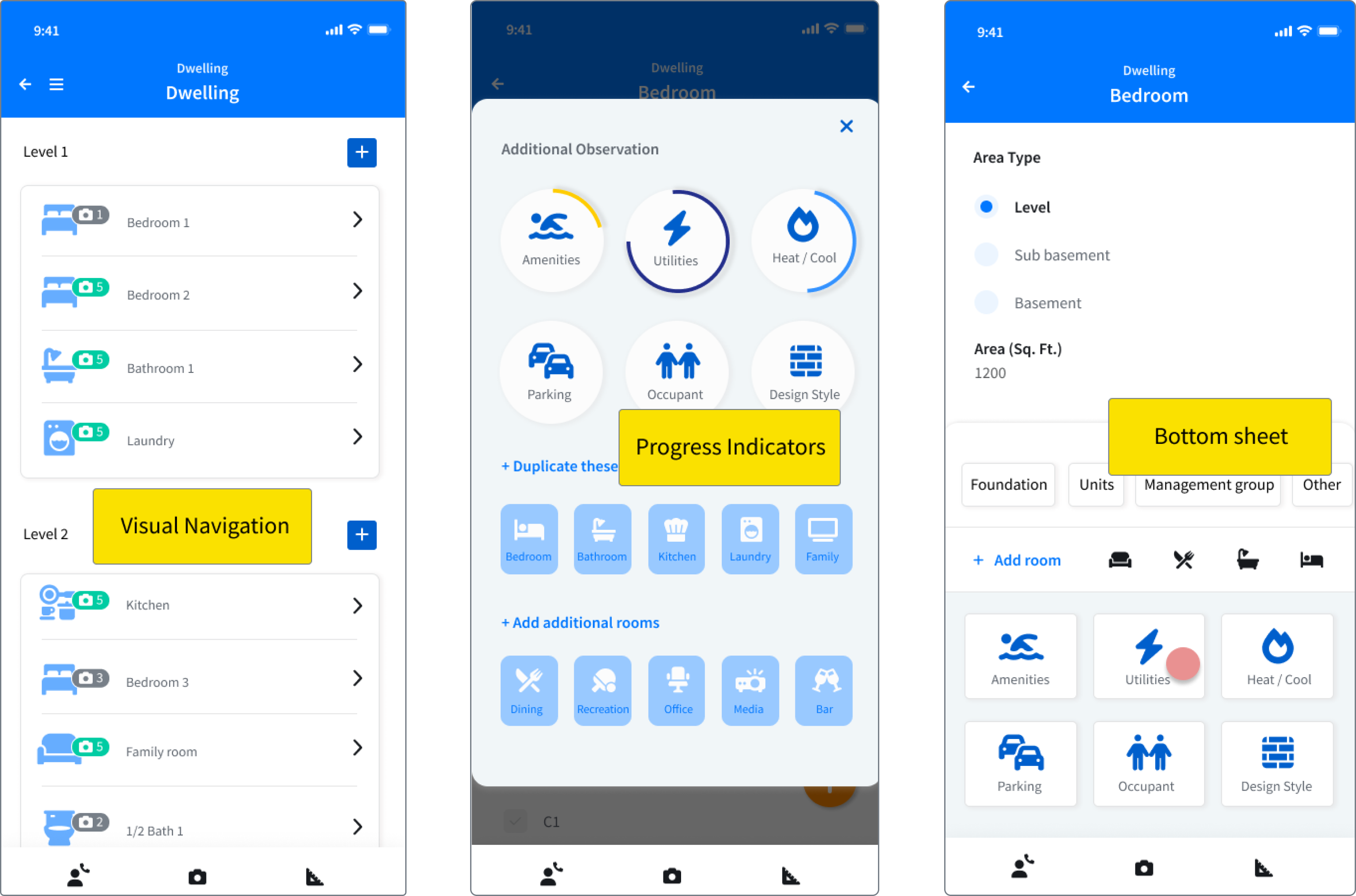
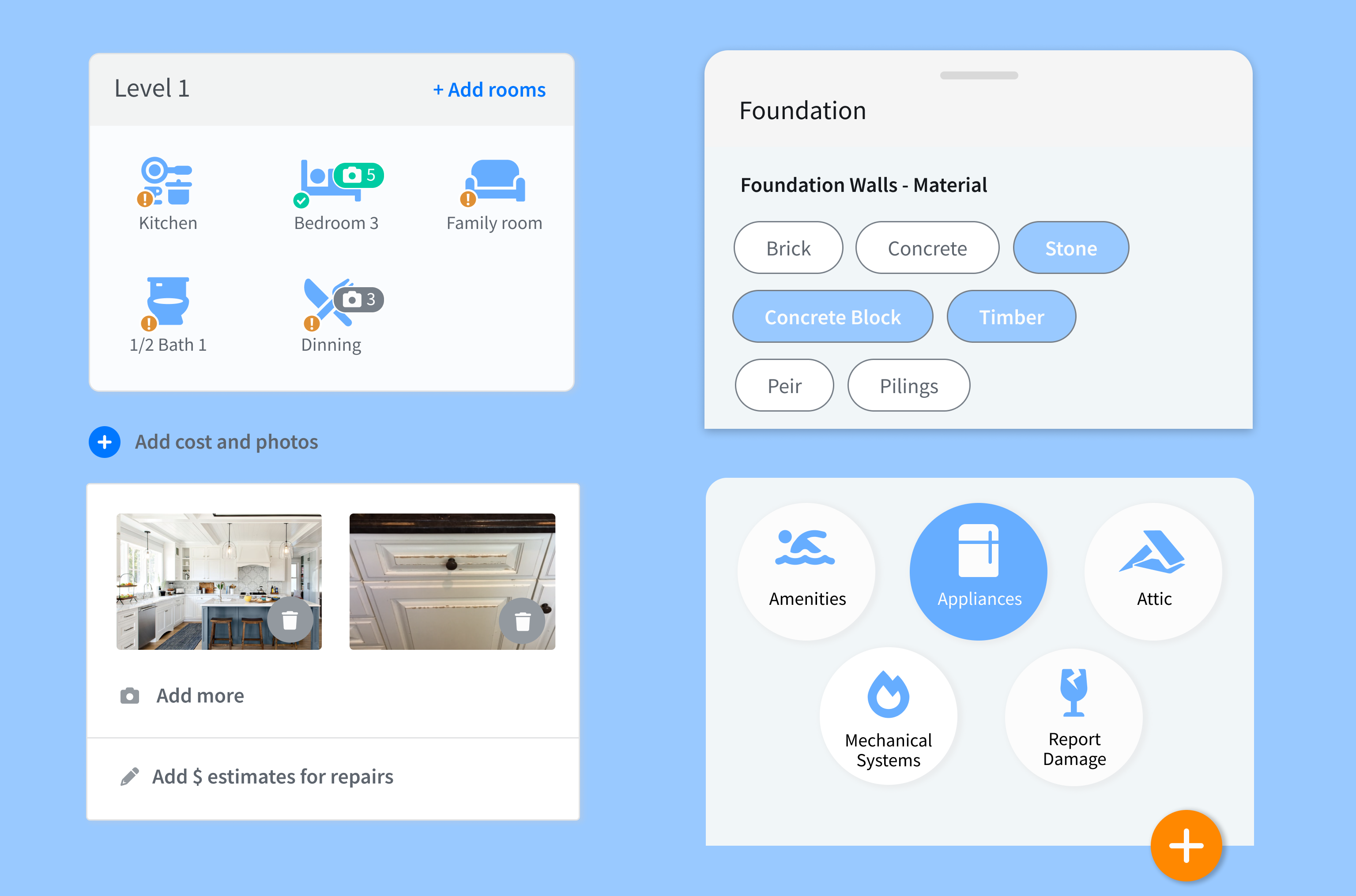
Redesigned screens
Icon-based visual hierarchy
FAB was available anywhere in the app to collect ‘Additional Observations’
Image display per room, keeping in the context
Ability to record damage with photo and notation
Final screens
Sketch floor plans and appraisal supporting questions
Learnings and next steps
In conclusion, the redesigned app offered a more user-friendly and visually appealing experience for users. Through extensive research and testing, pain points were identified and improvements made, ultimately leading to a more seamless user journey. The new design incorporated modern intuitive navigation, which enhanced user engagement and satisfaction. Appraiser evaluation times were significantly cut from roughly 1hr 30 minutes to 35-45 minutes. Finally, feedback from quality control was a substantial improvement in the quality and accuracy of data from appraisers.